Type, A Poem
By Dan Flynn.
Why Talk Type?
Type hasn’t really changed in 500 years.
Type is still the most effective form of communication.
A word is worth a word.
Type is literally everywhere.
Type is the first thing you see in the morning.
Type is the last thing you see at night.
Type is 90% of a brand.
Type is 90% of a UI.
Type teaches you everything you need to know about design.
Like all beautiful things Type is complex and sometimes confusing. The language used to talk type is niche and inconsistent. As we wrote last week, one of our priorities is to raise our own standard of knowledge, so starting with Typography presents a pretty worthy challenge. Over the last wee while we’ve been busy becoming just as clued up on Type as our Design Director, Dan Flynn, organising what we’ve been learning into our very own Type Library.
We started with what we already had in our Dropbox system and quickly stopped as the ‘whelm and questions set in. Where should we start and how do we even Type? What exactly is Anti-aliasing? When should we be using Serif or Sans Serif. Maybe Colour (but not colour)? How does this work with Figma? What if someone can’t edit with this font, what if it’s not even installed? What’s the difference between Grotesque and Transitional? Who even is Monotype and when do we use Descenders?
We were feeling it. Fortunately, when we get into these situations we remember that we’re Hypercollaborative™ and we set time aside to FigJam-TypeJam (before FigJam was a real Figma thing), and like magic, or something more explainable, we saw light at the end of the tunnel. Suitcase Fusion was going to get us there.
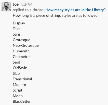
We started simply – organising fonts according to their foundry and assigning style tags to each typeface using Suitcase’s attribute feature. To understand when to best to use type for reading and when to best use it for seeing, we also assigned Display or Text tags to each typeface. We ran into difficulty at times as type can sometimes fall into a couple classifications of style. Tricky, but not something we couldn’t overcome.
We designated a master style (e.g. Neo-Grotesque), and then attached additional classifications on top of that master, (e.g. Geometric)*, so we could be flexible when searching and specific while categorising. Once the system was defined and in place, the library started to grow and the team could sync up and start finding the type of their dreams. To date we have 1752, including Arial, excluding Roboto.
*Neo-Grotesque, Geometric returned results like Circular, Roobert and Riforma which we actually used on a project released this week Nopeet.
So what did Sleepy Joe learn from organising the
Love + Money Type Library?
How great Type Foundries are – not only are they a great resource for studying type, but understanding why Typefaces are, like they are. Some great resources include Klim , #GTAcademy Grilli Type’s Instagram lessons, and Typewolf’s Flawless Checklist.
Use type appropriately. Know your Display from your Text. Don’t be using Blazeface for people to read up on the news, use it ‘for fighting the soulless generic work that maintains its steady footing in the pantheon of design trends’.
Choosing a font can be overwhelming, but once you’ve understood why it looks the way it does, read a bit about its history and lookalikes, you’ll be far more confident in selecting what you like.
Enough about Type, let’s get back into words. Jump in the comments and let us know what Foundries you’re digging at the moment. Was this useful? What would you like to hear about next?
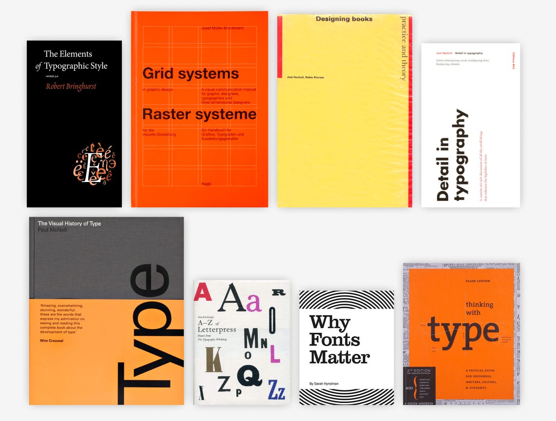
Recommended reading list for type:
The Elements of Typography by Robert Bringhurst
Grid Systems by Josef Muller Brockmann
Designing Books: Practice and Theory by Jost Hochuli and Robin Kinross
Details in Typography by Jost Hochuli
The Visual History of Type by Paul McNeil
Thinking with Type by Ellen Lupton
Alan Kitching’s A-Z of Letterpress by Alan Kitchin
Why Fonts Matter by Sarah Hyndman


